Shape

Shape began as a shower thought one summer evening in 2006. I was 16, and back then my home on the web was deviantART. I admired artists who could draw beautiful forms from a blank slate; in contrast, I felt like I was in a rut composing geometric presets. So, I challenged myself to draw something new from imagination each night. To keep the art simple and focused on form, I imposed a minimalist black and white format. The focus was on drawing shapes.
At first I was skeptical I would keep the habit, and probably wouldn’t have succeeded except for a trick: I promised myself I’d make 30 shapes before I’d share them with anyone. This turned out to be unreasonably effective at motivating me to continue until it became a habit. By the time I’d finished #30, the project had clicked: I’d gotten through the iffy beggining part and was now producing work that I loved and loving staying up late doing it. I settled into a groove of mostly silouhetted forms and conceptual art, with a few comics and typography experiments thrown in.
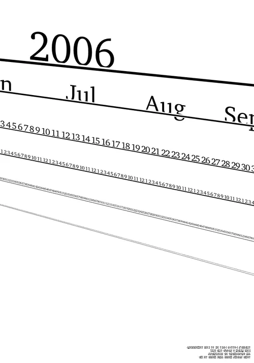
Overall, I drew 166 shapes, trailing off after my 17th birthday. Shape was often autobiographical, a process of digesting the most notable feeling or memory of the day. At the time, I was in my first year of an accelerated bachelor’s CS track at Portland State University. 2006 was filled with schoolwork, reflections on growth, and my first teenage romance. Shape was a perfect outlet to explore really specific ideas and feelings — without being too specific.
Shape taught me what a successful creative process looks like (for me, at least!). It worked because getting started was easy and I could make incremental progress each day. In another time or medium I don’t think it’d have come together so well. I’ve tried to rekindle that serial art journal magic again, but it’s easy to get overly ambitious. I find when takes more than a couple hours to make a piece, it’s harder to keep that raw connection to the work. Shape worked well because it was so efficient.
To this day, Shape remains one of the projects I’m most proud of. It’s powerful to believe in your work, and so fun and satisfying to learn by doing. Many nights set new high watermarks in the creative reach I felt working in vectors. At the time I felt I was making some of my favorite art I’d ever made, and I still feel this way about Shape today.
Restoring old artwork via time travel
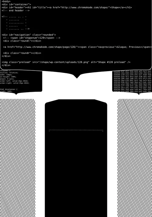
Over time, the custom Wordpress site behind Shape bitrotted and stopped working, and eventually I took it offline around 2014. Oof. Bringing it back has been a rainy day project for almost a decade. A priority for the project would be to leave Shape in a format more likely to continue working over time. Recently, static site generators emerged as an attractive choice.
Last weekend, I reworked the original PHP templates and CSS in Astro, bringing the original pages back online. Then, I set to work modernizing them. My goal was to re-render the original Inkscape SVGs in higher resolution, so they’d look sharp on modern 2x density screens.
This process turned out… a lot more interesting I thought.
Initially, my batch re-export of the original SVGs looked good enough. To make it easier to spot any differences, I hacked the page template to alternate between new and old renders:


Clearly, fonts I’d referenced in the art were missing, and there were some text kerning differences. I whipped up a script to index every missing font used in the source and got to work finding them on the web.
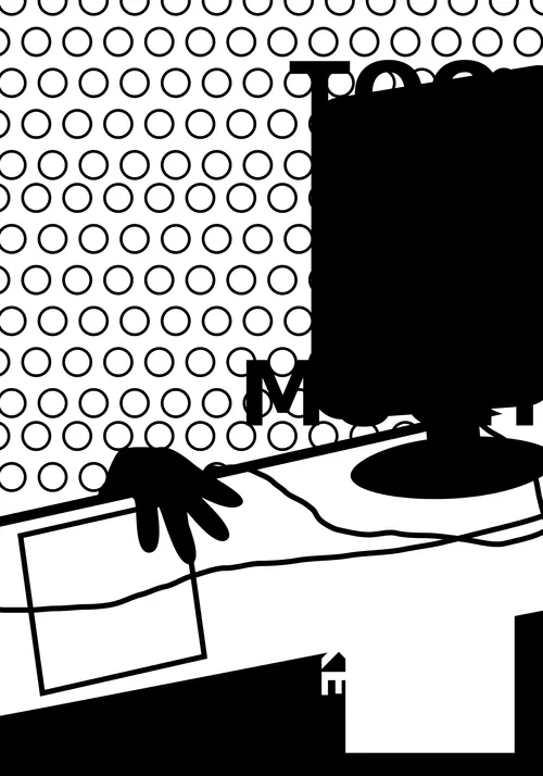
I also spotted some variations in line dash positioning, and subtle differences in pattern rendering. But wait — what’s that going on with the base of the monitor in the top left image? That was a regular circle element. Why was it distorted?
It became clear that to accurately upscale these drawings, I’d need to replicate all the bugs and quirky behaviors from Inkscape 16 years ago. I started looking at inkscape.org’s version archive, but then I realized: hey, I have a disk image of the laptop I used to draw these images. Could I render in the same copy of Inkscape I drew them in? (see also: Backing up 18 years in 8 hours)
I fished the image out of my backups, spun up a VM using virt-manager, and it booted!
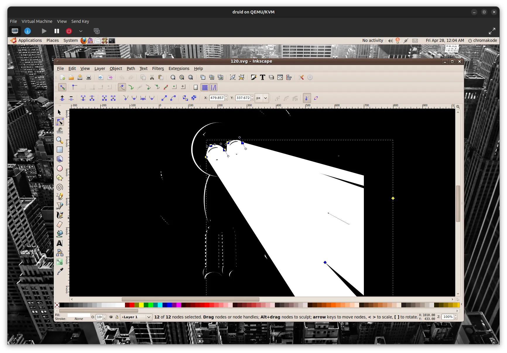
Wow. It’s difficult to describe what an intense feeling it was to crack open a time capsule like this. There was my login screen from 2007 staring back at me. I got the password on the first try. Waiting was my old desktop, lost emails, browser history, all frozen in time. I loved revisiting screenshots of old projects and desktop themes. Absolute nostalgia bomb. Inkscape worked too!
With the upscales now rendered in my original copy of Inkscape 0.45.1, I was still seeing some issues with dash positioning, so I tested out 0.44 as well. No difference. In fact, if I rendered an image at 1x, dash positions matched, but they’d appear differently at 2x and 4x. This appears to be a bug in Inkscape of that era, and didn’t impact the images much, so not worth fixing.
There were a couple other small differences (mainly cases where I probably forgot to save the final SVG after rendering, oops), and in one case, I’d downloaded the wrong font with the same name. I manually fixed the vector originals as best I could, and accepted that it wouldn’t be totally pixel perfect.
The results turned out beautifully. It was exciting to experience these familiar works in 2x density for the first time. One cool surprise was how the finer details affected perceived contrast in some of the images. Where previously tiny details antialiased into gray, the 2x renders became bright white on black.
I was already a digital packrat before this exercise, but this has only further convinced me of the unpredictable value of preserving old data in situ. If you have the space, disk images are by far the easiest and most flexible way to archive old computers. Hopefully these new 4x renders will be large enough to stand the test of time, but if I ever wanted to return to this project someday, it’s nice to know I can pick up where I left off.
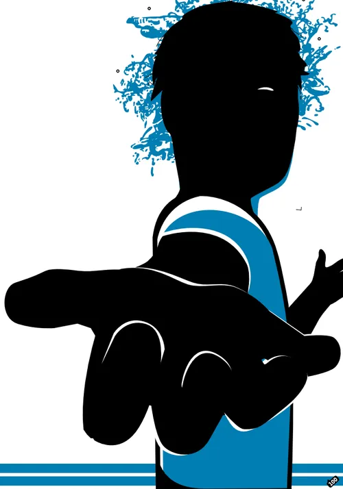
Sea Change
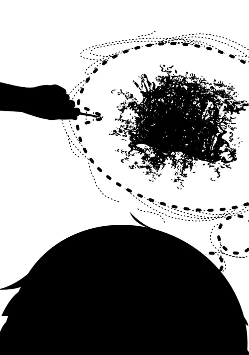
If I were to choose a favorite piece from Shape, it’d be “Sea Change”. Coming back to Shape half a lifetime later, it in many ways expressed my feelings transitioning into young-adulthood. Striving for context, to be understood, and to be loved. One of the paradoxes of growing up is that both your desires and how you understand what you want are developing at the same time.
When I drew “Sea Change”, I couldn’t yet put it in words, but I was getting close to figuring out the solution to this paradox: that what I wanted and who I was would create each other.
To get where I wanted to go, I needed to change my perspective.
There’s a funny little coda to this story. In my early 20s I printed out a poster-sized version of this image and hung it above my desk.
At the time, I was living my dream job at reddit. I’d grown up, moved out, gotten where I wanted to go, and beyond. I was happy, but I truly did not know what came next.
I didn’t realize at the time, but a couple years later I noticed I’d hung the poster upside down.