Hey, I'm Max.

This is my journal and sketchbook.

/ sleep-masks

An uncompromising guide to sleep masks (for side-sleepers)

A slideshow of photos of me wearing sleep masks

For the last 8+ years, I’ve worn a sleep mask. As a light sleeper, sleep masks help me sleep and nap more consistently in more environments.

Over time, I’ve tried many in search of the best, since I’ll be wearing one for literally a sixth of my life1. I’ve found that the design space for excellent side sleeping masks is very restrictive: there’s some key features to look for in a great mask.

This post contains no affiliate links. I have no sponsors, purchased these with my own money, and will not hold back my hot takes about these masks. My goal is to share what’s worked well for me2, and hopefully help you find the mask of your dreams (har).


Aside: I view both sleep masks and earplugs as habit and dependency forming sleep aids. Once you adopt them into your sleep regimen, it can be difficult to undo, because your sensory thresholds will change. There can be detriments, too: unwashed masks can irritate your eyes and skin, and earplugs worsen situational awareness in emergencies. Personally, it’s worth it to me because staying asleep longer has huge impact on my quality of life.


What makes a great side sleeping mask

For side-sleeping, the single most important factor for comfort is thinner masks and straps. Thicker material presses against the ears and temples, particularly with firm pillows. Bulkier masks also sleep hotter during the summer, so less material is an all-around win.

Another challenge unique to side-sleeping is mask deformation when pressed against a pillow. This causes masks made of stiff or structured material to fail to block light around the nose. An ideal mask has ample nose and side coverage to prevent gaps, and squishes without pulling nearby material out of position.

Masks with raised eyecups are more comfortable because they leave air space around the eyes. Some even allow you to open your eyes completely and look around without resistance. Of course, most shaped masks crush and press on the side of your head against the pillow, but that eye was gonna be touching a pillowcase anyway.

With a few exceptions, most masks let a tiny amount of light in at the nose. This is usually not enough to notice with eyes closed, but some masks cover the edges better than others.

After spending lots of time wearing both synthetic and silk covered masks, there’s no contest: silk is far more comfortable and cooler against the skin than most synthetics. Some masks claim to be machine washable, though hand washing is so easy that it doesn’t matter much.

I’ve found masks with two straps to be more comfortable, because they can be made thinner and rest further from the ears and temples. Two-strap masks also tend to stay in place better.

Finally, straps with sliding buckles are preferable to velcro. The hook side of velcro straps has damaged several of my pillowcases over time, and the noise of opening the velcro to tighten or loosen it can disturb other sleepers.

My favorite mask: Alaska Bear Silk Contoured Sleep Mask

  • Hybrid silk and molded foam, better than the sum of their parts!
  • Lightweight and blocks light well when worn loosely
  • Single silent sliding strap
A photo of me wearing an Alaska Bear Silk Contoured mask
Price$19.99
MaterialSilk + foam
StrapSingle sliding

My current favorite mask is the contoured version of Alaska Bear’s silk sleeping mask. This mask is extremely comfortable on its side, blocks light well, and does so with minimal pressure. The best of most worlds, save for the single strap.

This mask is a hybrid of two very popular designs: it’s a molded foam mask clad in silk. This makes the skin-touching material cool and comfortable, while keeping it from pressing directly against the eyes. Unlike some contoured masks, I find there’s not enough room to fully open my eyes without my eyelashes brushing the inside, but it’s much more comfortable than a non-contoured mask.

This mask is less wide than most, resting more on the front of the face. This is nice for side sleeping because there’s less material pressed between the side of my head and the pillow. It’s not the thinnest mask (Alaska Bear makes a thinner silk one, reviewed below, which also wears cooler), but the silk helps this mask feel less bulky and hot than other foam masks.

Another interesting side-effect of the silk surround is it provides an extra soft layer which conforms to the face better and fills gaps. This makes the mask handle deformation unusually well compared to other contoured masks. Only a tiny amount of light comes in under the nose, even when pressed from the side.

The only thing I miss from this mask is a dual strap version. The single strap is pretty good: made of thin and soft elastic with a silent sliding buckle for adjustment. However, it doesn’t prevent the mask from riding up. When this mask is adjusted large, the strap buckle can annoyingly press into my ear, limiting the usable adjustment range.


Ok. Now that you’ve seen the best, let’s review the two worst sleep masks I’ve ever worn (they’re also the two most expensive!)

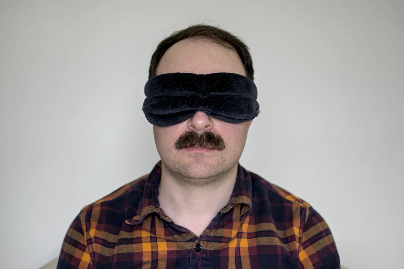
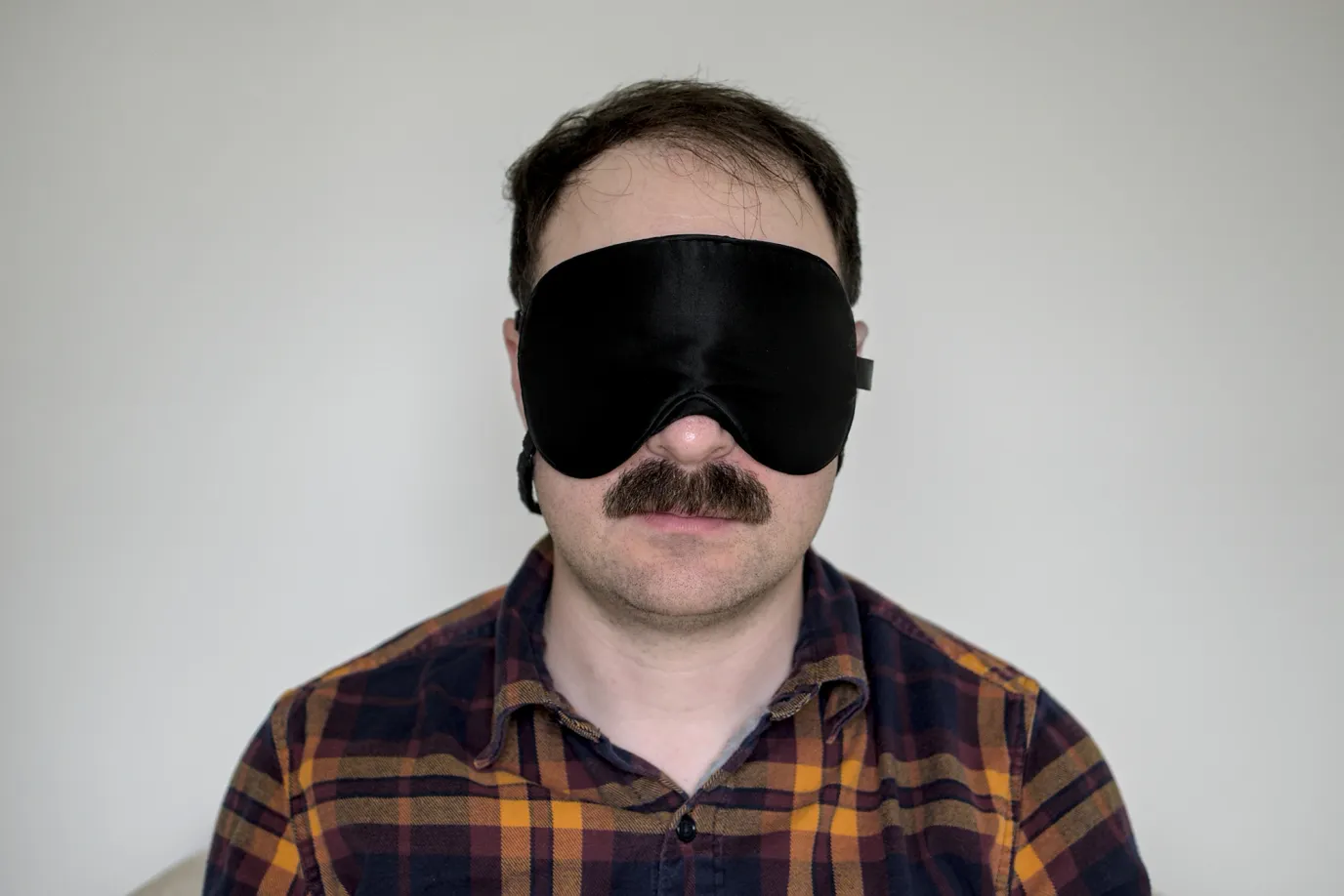
Tempur-Pedic Sleep Mask

  • Horrible
  • Super bulky with hard stitched seams
  • Blocks all light, only when worn uncomfortably tight
A photo of me wearing a Tempur-Pedic sleep mask
Price$29.00
MaterialVelour + foam
StrapSingle velcro

This was a surprise, since this mask is popular and many folks swear by it on reddit. At first I wondered if I’d received a lemon or a counterfeit, but my mask matches what I see on YouTube.

The strap is the widest I’ve ever seen (over 1”!) and made of loud scratchy nylon. Unlike most shaped masks which use molded foam, this mask has pleats and pouches sewn into it to form an eye gap. The eye gap is only somewhat effective: while there’s no direct eyelid pressure, my eyelashes brush against the inside and the lower lip digs into my lower eyelids.

The thick blue velour-like surface material is stitched together into firm seams which painfully press into my cheekbones when rested upon. The fabric is a dust and lint magnet. The front mask material loops back behind the ears, which can be painful since it’s so thick and noncompliant. It should go without saying that this mask sleeps hot.

The only positive thing I can say about this mask is if worn tight enough (increasing the clamping pressure on the cheekbones) it has very effective blackout, with basically no light leaks even in movement. When worn looser, the mask leaks light at the forehead.

The Tempur-Pedic mask ships with a comically large label attached which you must cut off. I don’t understand how many of these aspects could’ve been designed without a baffling indifference to the wearer.

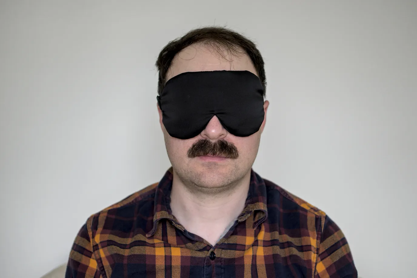
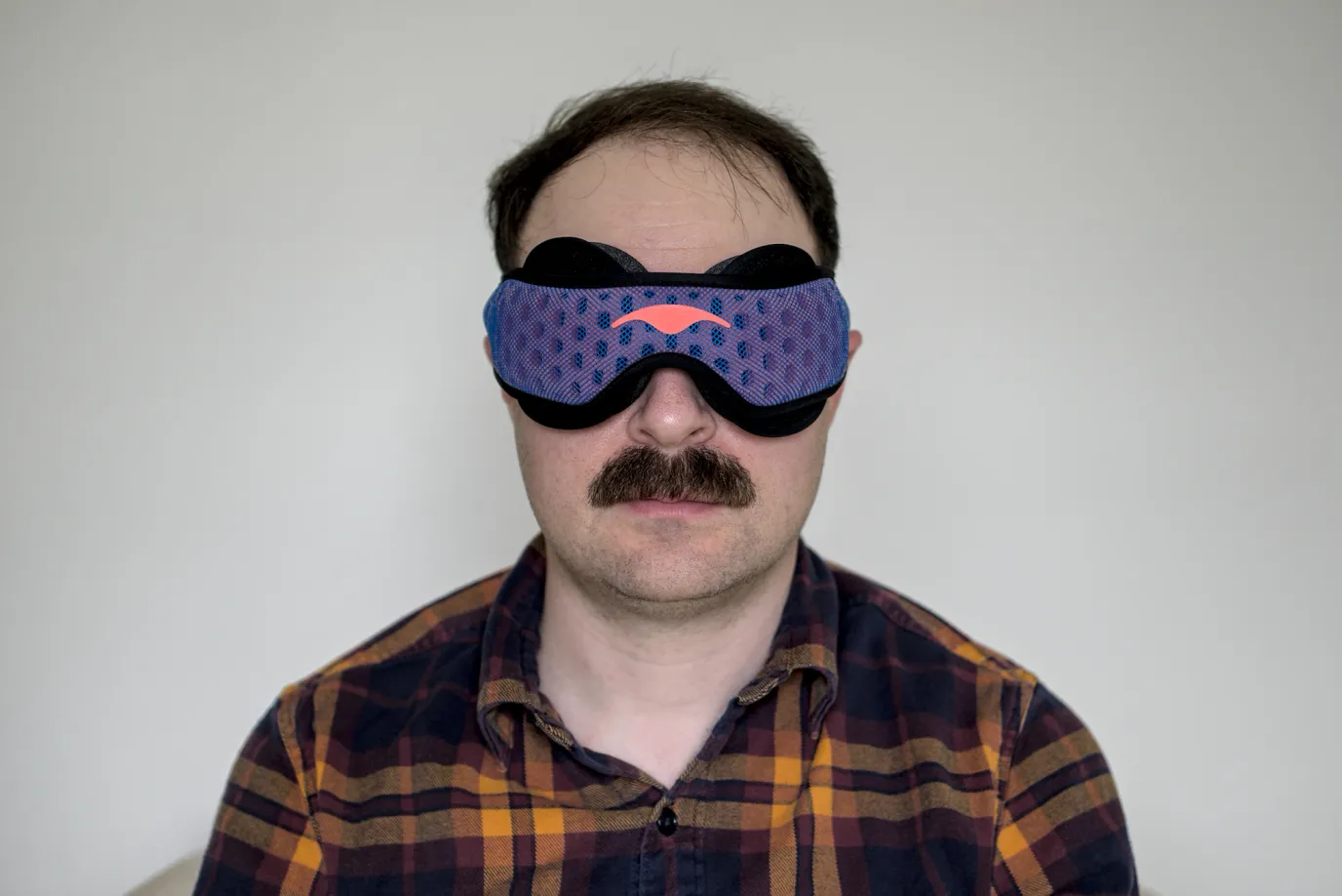
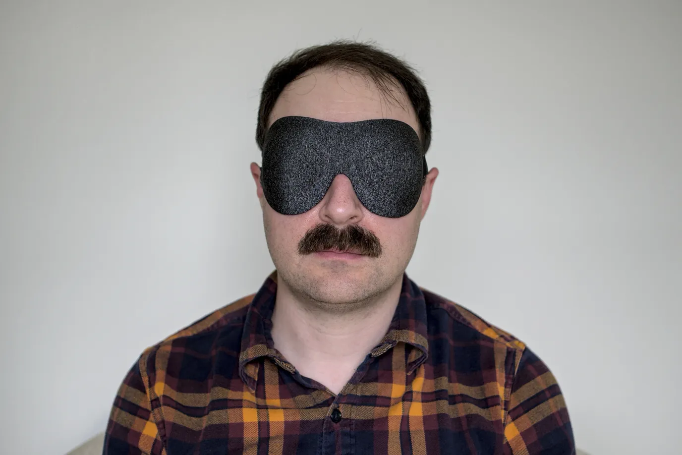
Manta PRO Sleep Mask

  • Unbelievably luxurious tech fabrics at an unbelievable price
  • Over-designed and bulky, but perfect blackout
  • Caused me to wake up seeing double 🔥
A photo of me wearing a Manta PRO sleep mask
Price$79.00
MaterialFancy synthetic
StrapSingle micro velcro

Oh boy did I want to love this mask. The Manta Pro has the wildest, most ambitious, most interesting design of all the masks I’ve tried. It’s also 3x more expensive. Unfortunately it’s tied for last place with the Tempur-Pedic mask.

I bought the original Manta Sleep mask off a Facebook ad in 2018. The customizable eyecup design looked really clever, and it delivered on the promise of flawless blackout with no direct eye pressure. Alas, I never could get comfortable with the eyecups pressing against the side of my head. So a few years later, when Manta announced a fancy redesign specifically catering to side sleepers, I was very interested.

The construction of this mask is badass: to keep lightweight and cool, the strap is made of laser preforated foam wrapped with mesh. The parts that touch skin are made of deliciously soft and cooling tech fabric. And yet — there’s still way too much material in front of your face. Despite throwing the book at the original mask’s airflow problem, Manta Pro still feels hotter than most masks I’ve tried, probably due to the tight seal around the eyes.

Simply put, this mask is an iteration on a fundamentally flawed concept for side sleepers. The marquee feature of Manta masks is the repositionable eye cups which provide enough space to completely open your eyes inside them. Really cool! The problem is, if you move around while you sleep, especially on the side or front, the raised ridges around the eye cups can get offset, and now there’s raised ridges pressing directly into your eyes.

Several times after sleeping with this mask, I started my day with blurred vision due to pressure on the corner of my eye while I slept. I spent hours detaching, repositioning, and rotating the eyecups, figuring this was user error. I cranked that luxurious strap as tightly as I could to try to keep it in place. One day, I woke up seeing double: the pressure against my right eye had caused it to stop aligning with the left. At that point I concluded it was unsafe for me to continue using this mask.

If I was a back sleeper, this would probably be my endgame mask. It’s an amazing sitting up eyes open perfect darkness goggles… thing, but it’s not a good side sleeping mask at all. The Manta Pro convinced me that for side sleeping masks, less is more.

Which brings us to the ✨ Alaska Bear ✨.

Alaska Bear 2 Strap Sleep Mask

  • Incredibly lightweight and breathable
  • Double silent sliding straps are out of the way and can be worn loose
  • Lack of structure presses against eyelashes, weird nose flap
A photo of me wearing an Alaska Bear 2 Strap sleep mask
Price$15.99
MaterialSilk
StrapDouble sliding

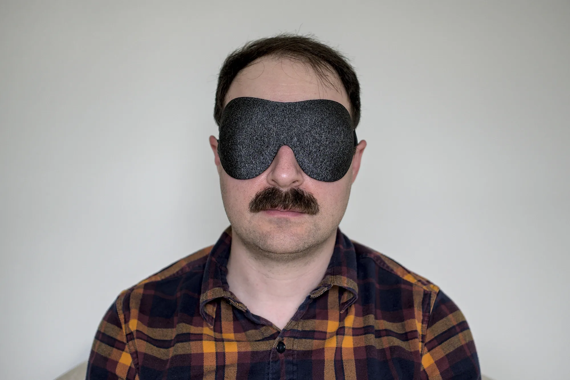
Not to be confused with the contoured silk mask covered earlier, this Alaska Bear mask is simple and old school: it’s a thin pouch made of silk containing a sparse fibrous filler, with two straps to wrap it around the head. Because this mask is so thin and compressible, it’s almost unnoticeable when pressed between the head and pillow. It’s not thick enough to get in the way.

This was the first mask I tried made of silk, and it’s noticeably more breathable and comfortable against skin than the synthetic ones. The material of this mask is so thin that a small amount of light can shine directly through the mask — this is the only mask I’ve tried that does this. FWIW, I’ve spent a ton of time with this mask, and it was never a problem in bedroom lighting.

The straps on this mask are effectively perfect. Every sleep mask should have these straps. They’re imperceptibly thin, elastic, and have silent adjustment buckles for a customizable fit. Due to the double straps, the light weight of the mask, and the low friction material, this mask stays in position really well, even when worn pretty loose.

The lack of shape / structure in this mask is the main source of drawbacks. When worn, silk directly touches my eyelids and lashes, and opening my eyes is uncomfortable. This posed less of a problem while sleeping than I anticipated. Also, it’s difficult to figure out which side of this mask is the front; the only discernible difference is the strap and nose flap stitching bias slightly inwards when the tag is on the left side.

This mask has a little extra fabric under the nose bridge which is intended to form a gasket to block light leaks around the nose. It only works so-so in practice, and makes donning the mask more cumbersome because it must be flipped up to work. I still often had light leaking from below my nose due to the lack of a contoured shape.

Even with its flaws, this mask was my favorite for a long time owing to its simplicity.

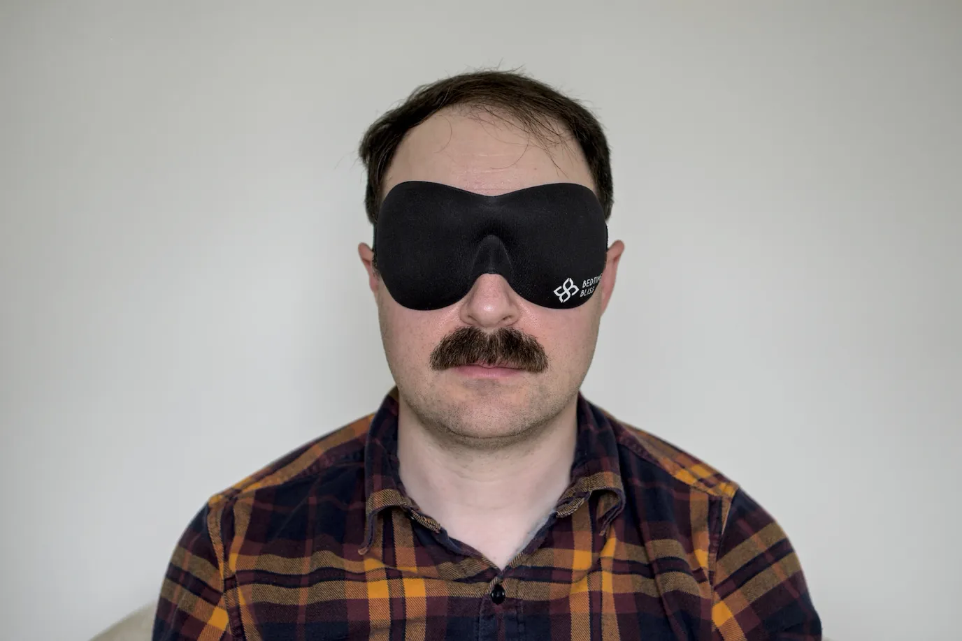
Bedtime Bliss Sleep Mask

  • Inexpensive and effective contoured mask
  • OEKO-TEX certified materials, maybe?
  • Giant branding on the front, loud velcro strap
A photo of me wearing a Bedtime Bliss sleep mask
Price$7.99
MaterialBamboo/cotton + foam
StrapSingle velcro

The Bedtime Bliss is a simple foam contoured mask with a single velcro strap. This mask has the best geometry for me of the molded foam masks (of which you’ll see there are many), perhaps owing to the wide ridge around the eye cups making good contact. The deep contour allows me to fully open my eyes and blink without any resistance. The mask shape also does a decent job blocking light leaks around the nose, though I still get a tiny amount. More light can leak when this mask is deformed or pulled by a pillow. The strap is a basic single elastic band with loud velcro fastening.

This was the first mask I wore consistently and I have long term experience with it. Overall, I still like this mask and would happily wear it, though I find the material less pleasant than silk masks. Bedtime Bliss claims to be made of OEKO-TEX certified materials, though it misspells that several times on the Amazon page. The mask used to be sold with a blank black front, though now it’s emblazoned with a huge logo under the left eye.

The fabric on the outside of this mask tends to come unglued over time, revealing gray foam, though the mask still blocks light fine. The velcro strap has exposed hooks on the back of the mask, which has scratched my pillowcases and caused them to pill. An easy fix is to cut the end of an old mask strap and stick it to the hooks, covering the gap.

Alaska Bear 2 Strap Contoured Sleep Mask

  • Double silent sliding straps ❤️
  • Doesn’t fit my face: always leaks light at the bottom
  • Expensive, but nice materials
A photo of me wearing an Alaska Bear 2 Strap sleep mask
Price$19.99
MaterialSynthetic + Foam
StrapDouble sliding

A foam contoured mask with double slider straps? Sounds amazing. Unfortunately, the shallow nose bump and eyecup shape don’t fit me. It might fit you better, though. The straps on this mask are absolutely perfect, like the other two-strap mask made by Alaska Bear.

Most foam molded masks are cheap enough that you can buy a bunch and pick the best, but this one is anomalously expensive. There doesn’t appear to be anything special about its construction: it’s another foam base with synthetic fabric glued on top.

This mask is a good example of the issues with contoured masks and variations in face shape. There is no combination of position or strap tightness I can find that doesn’t leak heaps of light under the nose bridge. Same issue for my wife. Perhaps if you have a shallower nose bridge this mask could work better for you.


We’re now deep in the realm of molded foam masks with slight design variations. You can find heaps of these on Amazon. To round out this guide, here’s two notable ones.

LKY DIGITAL “Sleep Mask for Side Sleeper” (lol)

  • Cheapest option, comes in a pack of 3
  • Nice materials, single silent sliding strap
  • Great geometry but deep nose cutout leaks tons of light when deformed
A photo of me wearing an LKY DIGITAL sleep mask
Price$5.33
MaterialSynthetic + foam
StrapSingle sliding

This is a really nice mask, save for a fatal flaw when side sleeping. Ironically, this mask is marketed specifically for side sleepers.

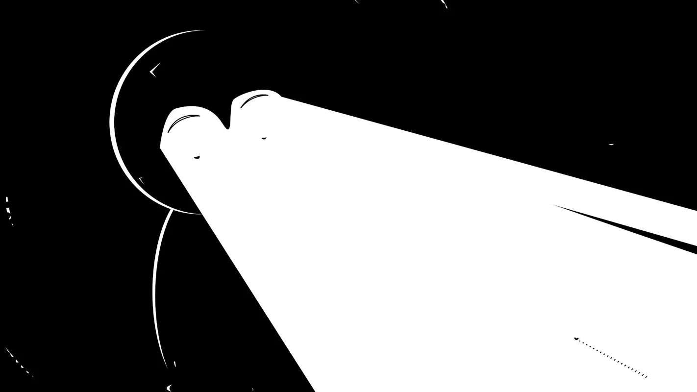
The mask has the largest, flattest nose cutout of any I’ve tried, and it works pretty well sitting up: regardless of nose size, only a tiny amount of light peeks by. However, as soon as there’s any pressure from the side, this mask transforms into the leakiest one on this list. Making matters worse, the leaked light is centered in view due to the high cutout, unlike most other masks where bottom leaks are in the periphery. In the photo above, you can see how the gap goes right up to between my eyes. For me, this is a total dealbreaker.

Otherwise, this mask has a lot going for it. Even though it’s inexpensive, it doesn’t feel cheap. The material is soft and the eye cups have a nice shape to them. It even has a decent sliding strap! If this mask had a different nose cutout with more coverage, it’d be a solid recommendation from me.
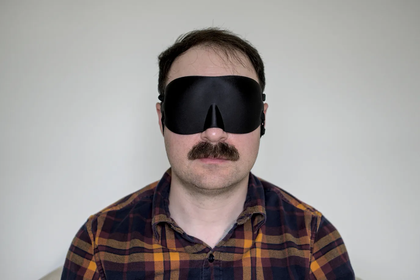
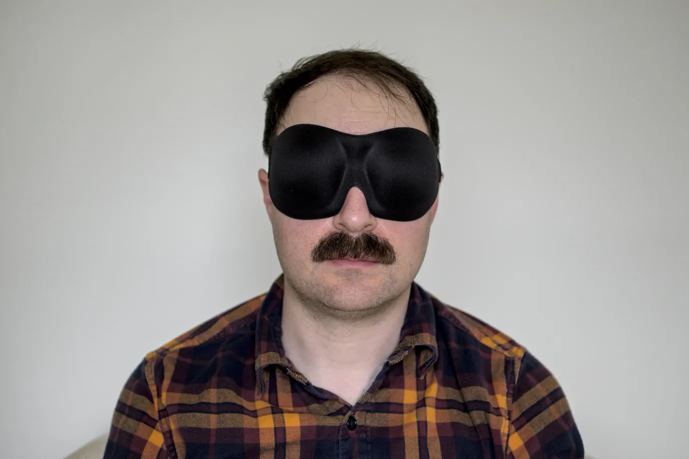
  • Wide & deep cups give eyes space when pressed against pillow
  • Many printed designs available
  • On the expensive side, loud velcro strap
A photo of me wearing a Bucky 40 Blinks sleep mask
Price$12.00-17.99
MaterialSynthetic + foam
StrapSingle velcro

The Bucky is superficially similar to many other molded foam masks in this list, but it’s wider and has deeper eye cups. It also comes in a variety of nice looking printed designs. The extra large eye cups do a remarkably good job at keeping pressure off the eyelids. Even when I intentionally jam my head into a pillow, I can open my eyes fully without any eyelash contact.

This comes with a tradeoff, though: due to its larger size, I find the Bucky is a bit more liable to shift on my head due to it making more contact with the pillow. The Bucky has a similar deformation problem to other molded form masks when side sleeping, with moderate light gap opening up at the nose.

This mask unfortunately has a loud velcro fastener, which may disturb anyone around you during late night adjustments. Bucky sensibly puts their logo on a small fabric tag by the strap (looking at you Bedtime Bliss). This mask is quite good as far as molded masks go, though the Bedtime Bliss offers similar performance at half the price.

Bucky also sells an “Ultralight” sleep mask which looks suspiciously similar to the LKY DIGITAL mask, high nose gap and all.

Final remarks

If you read all the way to the bottom, perhaps you share my strange obsession with sleep masks.

Did I miss your favorite one? I’d be happy to try other masks out (which offer something distinct from the ones above) and add to this list.

Drop me a line on Mastodon, or you can email sleepy@chromakode.com.


As for my overall recommendations, if you scrolled to the bottom looking for them:

For the best all-rounder side sleeping mask, I prefer the Alaska Bear Silk Contoured.

If you want the lightest and coolest, the Alaska Bear 2 Strap Silk is excellent too.

An economical foam alternative would be the the Bedtime Bliss sleep mask.


These have worked best for me, but a different mask might suit your personal preferences and head shape better. If you’ve had a different experience with any of these masks, I’d love to hear about it. Hopefully this guide has offered some useful jumping off points.

Sweet dreams!

Footnotes

  1. I typically go to bed without wearing a mask and don in the early morning before light.

  2. YMMV. What works for you depends a lot on the shape of your head and sleeping style.

/ xkcd-machine

Development notes from xkcd's "Machine"

On April 5th, xkcd released Machine, the 15th annual April Fools project I’ve made with them.

It’s a game we’d been dreaming of for years: a giant rube goldberg machine builder in the style of the classic Incredible Machine games, made of a patchwork of machines created by individual xkcd readers. For more details, check out Explain xkcd’s wonderful writeup.

This is the story of how we built Machine in 3 weeks, and what I learned along the way.

April 1st is a special occasion where I and others collaborate with xkcd on ambitious interactive comics. This project had the largest group of contributors to date! Expand for full credits.
  • Randall, davean, and I created the art, backend, and frontend respectively.
  • Ed White designed and built the moderator UI.
  • Alex Garcia implemented the hook, wheel, prism, and cat widgets, with contributions to the React physics integration.
  • Kevin Cotrone wrote the meta machine generator which determines which inputs and outputs each tile has, and built backend infrastructure.
  • Conor Stokes (with his daughter Ami) implemented the cushion, bumper family of widgets, and refined the physics stepper.
  • Liran Nuna implemented the boat that floats at the bottom of the comic.
  • Benjamin Staffin improved the deployment pipeline and moderated submissions.
  • Manish Goregaokar, Patrick, Amber, and Michael Leuchtenburg moderated submissions and gave creative feedback.

Early machinations

It took us deep into March, turning around ideas we were kinda excited about, to find the one that had us all sitting bolt upright.

”Could we make a really big tiled mechanism like the blue balls GIF? Where everyone contributes a small square?”

This referenced a classic viral GIF from 2005 (warning: loud music), which was a collaboration composed of tiles made by Something Awful users:

A classic internet GIF animation of blue colored balls moving around a complicated rube goldberg machine mechanism

Sometimes an idea feels like it emerges fully-formed, but when you start talking about it, you realize there’s still a dizzying array of decisions to make. Thus ensued 5 days of brainstorming to discover each of us had slightly different core beliefs about what this comic should be:

  • Where do the balls come from?
  • Does everyone see the same machine? What is its purpose?
  • How can players interact with it?
  • And most importantly… why do they?

Learning from previous attempts

My favorite and least favorite interactive comics we’ve ever done have centered around user contributed content. My personal fave was Lorenz, an exquisite corpse where readers evolved jokes and storylines by writing in panel text. So much fun!

Screenshot of comic #1350, "Lorenz"

It doesn’t always work out how we hoped, though. Take 2020’s Collector’s Edition:

Screenshot of comic #2288, "Collector's Edition"

In Collector’s Edition, players found stickers scattered across the xkcd archives. They could then place each sticker once, permanently, on a global shared canvas.

Wouldn’t it be cool if readers could make their own comic panels together? This was the idea we started with, which got pared down to the sticker concept.

Unfortunately, the game design didn’t yield the desired results:

  • The initial view for all players was the center of the map, which was initially blank. It quickly descended into chaos. Chaos became every player’s first impression of the game.

  • There was no incentive to carefully consider where to place a sticker. Players didn’t have enough agency to advance the plot through their individual action. This limited creativity to simple patterns like tiling similar stickers or forming lines.

  • We didn’t provide an overarching story or goal. The stickers you had didn’t obviously relate to the others already on the page (the fridge poetry magnets were fun, though).

For a collective canvas to shine, the experience should teach you by example what’s cool to make with it. It helps to have a shared context and purpose which motivates what to create.

Designing constraints

Once we knew we were building a big collaborative marble drop, we were awash with too many choices. Many early approaches seemed like unsatisfying trade-offs, or very difficult to implement. The only thing we were really sure of was there would be a grid of interconnected machines players would create.

How big should the overall machine be? Let’s consider 100x100, arbitrarily. How would we simulate it? Running 10,000 tiles in realtime on the client, each with tens of balls, seemed like a risky goal.

Also, how could players create subdivisions of a large, complex machine without communicating directly? How would we know tiles designed in isolation would work when integrated together?

Many thought experiments later, we ended up with 3 core principles:

1. Maximize player expressiveness at the cost of correctness.

How predictable did the machine need to be? We considered running the whole thing server side. Another option was to simulate individual machine tiles to validate them. This would give us some assurance that when everything was connected, the machine would work.

Perhaps if the machines were deterministic enough, we could also estimate the rate balls exited each tile. We could use that to approximate the overall flow of the machine, so we could feed tiles balls at the proper rate without running every tile.

Once we had a prototype editor running, Davean quickly dispelled this idea by creating a machine with long patterns of chaotic ball collisions:

Unless balls moved in straight uninterrupted paths, clearly it was easy for players to make very unpredictable machines. Randall wryly suggested we add double pendulums.

From a design standpoint, this settled that making the machines more predictable would trade against degrees of freedom players had. Also, in the face of a tight deadline, it’s best to keep it simple, which favored an approach light on prediction or simulation.

We decided to prioritize players having tons of flexibility in what they could build — even extremely nondeterministic or broken machines. This meant we’d need active moderation, both to verify that machines satisfied the constraints, and to remove any offensive content.

2. Give players firm constraints that encourage resilient, interchangeable machines.

Accepting moderation and unpredictable player machines made another useful decision for us: ironically, it forced us to require more order between the machines.

Early on, we’d considered making the inputs and outputs of machines totally free-form: where previous tiles output balls on their edges, future players would build outwards incrementally. Then we looked at how moderation would work. There was the possibility that we’d need to replace a tile from early on.

If tile designs depended on previous ones, this could break a large portion of the machine. This led us to design tight enough constraints that multiple players would create compatible designs within the same tile space.

This is the Robustness principle in action: “be conservative in what you send, be liberal in what you accept”.

To provide players with input and output constraints, we’d need a map of the whole machine from the start. Generating the map also gave us the opportunity to vary how challenging the machines would be (we called the tile configurations “puzzles”). Kevin’s map generator transitions from simple single-input single-output puzzles to complex 4-in-4-out merges in the middle, back to 2 outputs per tile at the end.

On the player side, we designed the constraints so we could give players realtime feedback as they constructed their tile. By requiring that tiles output balls on average at roughly the same rate as they received them, we could discourage machines that ate balls or created a lot of latency (e.g. pooling them up). We chaos tested tiles by randomizing the rate of balls entering the editor to reflect the variance upstream.

Our general philosophy became “run the machines for a while, see if on average they meet the constraints given uneven input”.

3. Machines should reach a steady state in the first 30 seconds.

This led to a new question: how long would moderators have to watch? We made the arbitrary decision that it should take 30 seconds for machines to enter a steady state, based on napkin math for how long it’d take to moderate the whole machine (e.g. 10k tiles => 83.3 hours).

We also made balls expire after 30s. Initially, when there was no expiration, I noticed that everyone’s first experience was balls piling up and filling their screen while they learned how to play the game. This would also bog down the physics simulation as it accumulated a huge number of active rigid bodies. Instead of being fun, the balls were getting in the way!

Screenshot of Machine with a tutorial popup reading "For security reasons, balls that remain in your device for mosre than 30 seconds will be removed and destroyed."

Expiring the balls helped players fall into a pit of success, because machines would not accumulate errors over time. It also drastically simplified moderation, because after watching for 30 seconds, you’ve seen where most balls can end up in their lifetime.

Simulation and hyperreality

The architecture of Machine made two big bets. The first was: with all of the above design constraints in place, connecting together disparate tiles into an overall machine would work. We generated and solved a few smaller maps to shake that out.

Back to another problem, though: how could we display a giant machine if we couldn’t run it in realtime on either the server or client?

Before reading further, I’d encourage you to send a little time scrolling around the comic and imagine how it works. Because what follows will spoil it in a big way.

As a northstar, I wanted it to be possible to follow a single ball from the top of the machine to the bottom. This meant that even if the whole machine wasn’t being simulated, a window around what the player sees would need to be.

Once an early version of the map viewer was working, I started testing out an infinite map with only the viewable area simulated. It looked pretty good — but you can see gaps in the flow when I scroll up, because the initial state of the tiles was empty as they enter the simulation.

Instead of an empty tile, we needed them to appear to already have activity in them. So here’s the second bet: we’d snapshot tiles after they’d reached their steady state, only bringing the snapshots into existence just before they scrolled into view. Would players notice?

Here’s a view of the final comic, with display clipping turned off (you can do this by disabling the overflow: hidden and contain: paint CSS properties on the containers):

Did you notice the snapshots? Unless I’m really looking for them, I don’t.

Only the tiles you see rendered exist in the physics simulation. Note that there’s also a minor display optimization going on: even though you only see the balls inside the viewing area, they’re simulated within the whole tile extents. To pretend there’s more machine up above the view, balls are created and fed to the tiles at the top row of the simulation (based on the expected rate of their input constraints).

To create snapshots, we tied them into the moderation UI. Mods must wait at least 30 seconds before approving a tile. We then take the snapshot when they click the approve button. This gives mods discretion to wait a little longer for the machine to enter a nice looking state.

Snapshotting worked way better than we expected. A really nice consequence is that it resets accumulated error in the machine. As you scroll around, your first impression of a tile is a clean good state that a moderator liked. In practice, if you watch long enough, many machines can get wedged into stuck or broken states, but you’ll never see them if you keep exploring, because you’ll enter fresh snapshots.

The machine you’re scrolling around in the comic isn’t real. It’s hyperreal. The whole thing is never simulated in its entirely, and I think turned out better that way!

Rendering thousands of balls with React and DOM

Machine is built on the Rapier physics engine. Rapier was fantastic to work with: it has great docs, a clean API with lots of useful primitives, and has impressive performance thanks to its Rust implementation (running as WASM in the browser). I was also initially drawn to Rapier’s determinism guarantees, though we didn’t end up doing any server side simulation.

On top of Rapier, I wrote a custom React context, <PhysicsContext>, which creates Rapier physics objects and manages them within the React component lifecycle. This made it easy to develop a “widget” component for each placeable object with physics or collision surfaces. Effectively, React functioned as a quick and dirty scene graph. This simplified loading and unloading tiles as the view scrolled: when a tile unmounts, all of the physics and DOM are cleaned up. As a bonus, it made it easy to wire up hot reloading with fast refresh, which was really nice for tweaking collision shapes:

Another cool aspect of the React context approach is that all of the physics hooks noop when they’re not inside a <PhysicsContext>. This is used to render static previews of tiles for the moderation UI.

I wish I had used components instead of hooks to create rapier objects. I later discovered this is the approach react-three-rapier takes, and it fits better with React diffing (vs. useEffect which destroys the old instance and recreates on dependency change).

Machine is rendered entirely using the DOM. During early dev I was leery I’d reach the end of my rope perf-wise. I expected I’d eventually ditch DOM rendering for PixiJS or canvas when it got too slow. However, I wanted to see how far I could take it, since it meant less to build.

To optimize rendering performance, the frame loop applies styles directly to widgets with physics simulation. Thus React’s diff only runs when structural changes are made to the scene graph. Initially balls were rendered by React, but the frequent creates / removes were low hanging fruit for reducing diffs, so I created their own optimized renderer. Another win was draw culling for balls and widgets out of view. This performed well with 4000 balls in simulation and hundreds onscreen, so I settled on the DOM-only rendering approach.

I’ve heard comparisons drawn between modern browsers and game engines, with their tightly optimized GPU rendering and DOM / scene graph. The similarities have never felt more apt.

API and Moderation

Machine’s backend was written in Haskell by davean and Kevin, with redis as backing store. We used OpenAPI with OpenAPI fetch to share types between the codebases. This approach had some teething pains adapting Haskell types, but ended up very helpful for coordinating late breaking API changes. This was also my first project using TanStack Query, which was quite handy for caching and automatically refreshing the machine without server push.

The moderation UI, designed by Ed White, was critical for us because it bottlenecks all submissions being published. Mods must choose from potentially hundreds of designs for a particular tile. We used a simple approach but unreasonably effective approach to prioritize the queue. Each type of widget has an interestingness score, and we count each instance to sort candidate tiles. This biases towards maximalist solutions, though mods counteract that by reviewing the middle of the list for more minimal ones.

The large imbalance between the number of submitted designs and those published in the machine is unfortunate — it’s my least favorite thing about this comic. We searched for a way to make more of the back catalog available prior to launching, but there wasn’t a good compromise given our moderation time constraints. We’d like to find ways to share more of the submission dataset after live submissions are finished.

One nice UX finding came from the moderation approve cooldown. Since tile snapshot quality is so important, I hacked in a countdown timer which disabled the moderator approve button until at least 30 seconds had passed running the simulation. This ensures that snapshots are taken of a steady state, and gives time to check that outputs are receiving balls at the expected rate. I initially expected this to be annoying to mods, but to my surprise, they liked how it prevented hasty decisions.

Post-launch, I added a slider that allows moderators to speed up the simulation to much faster than realtime. This saves a ton of moderator time, because now the first 30 seconds of a submission can be viewed in under 5 seconds. It’s also quite useful for reviewing the behavior over a longer span of time.

A note of appreciation for the “Jamslunt Interfoggle”

Finally, I’d to take a moment to appreciate one of my favorite machines. It’s a great example of how even with all our editor constraints in place, serendipitous and funny unintended consequences happen between tiles.

The “Jamslunt Interfoggle” was posted within the first couple hours the comic was up. It’s a clever mechanism that exploits the narrow field of fans. It queues blue colored balls in a chute until they accumulate enough weight to spill out the sides.

However.

The tile that ended up above the Interfoggle, “Bouncy”, is a chaos engine launching balls across 3 crossing paths. Every once in a while, it will send a green ball through the wrong output, which wrecking-balls through the logjam and sends a cascade of blue balls through the Interfoggle.

The Interfoggle can’t have been designed with this behavior in mind, because we only feed the correct color in the editor (this was a conscious decision to make inputs easier to understand). Yet, this machine is so much better with the green balls in the mix.

One of the great joys of making a project like this is discovering all the creative ways people use it, intentional or not. Even though I know it’s coming, I’m continually amazed by how brilliant the internet is when given a shared canvas. Thanks to everyone who contributed tiles.

At the time of writing, there’s still a little time to add your own design to the final machine.


You can check out the source code of Machine here. Feel free to drop me a line on Mastodon if you have any questions about it. One cool thing to hack on would be implementing a full global simulation of the machine. I’m quite curious to see how well it works.

I hope you’ve enjoyed this deep dive into “Machine”. For more xkcd stories, check out these notes from our space exploration games and 2021’s Morse Code April Fool’s comic.